 Process Matrix-Map
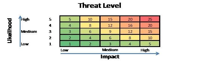
Risk maps can help an agency identify the best response to a
risk. As agencies see a greater risk,
they can plan a response. The risk map
shown above illustrates different levels of impact and probability of a
risk. The green-zoned areas should be
responded to with a high level of monitoring to ensure that the risk does not
escalate to a moderate or high (yellow, orange, or red zoned areas) risk. For risks with higher levels of impact and
probability (yellow, orange, and red zones), the agency should take a stronger
response and have a higher commitment level of managing these risks.
Risk assessment tools can vary from qualitative to
quantitative. (The chart below
illustrates the difference between these two methods.) A list of risks is a good starting
point. Just formulating a list of risks
is, and garnering the knowledge of your system, is valuable. Not all of the risks identified are
quantifiable. Sometimes just identifying
them and adding them to the list of risks is the only quantification available,
and necessary. Don’t get frustrated with
this process. Not every risk has to be
run through a sophisticated assessment model to be valid.
|
Qualitative
Data |
Quantitative
Data |
||||
|
Overview:
|
Overview:
|
||||
Qualitative data:
|
Quantitative data:
|

From “Qualitative vs Quantitative
Data,”;
Created by Donna Roberts
Copyright 1998-2009 http://regentsprep.org
Oswego City School District Regents Exam Prep Center